UX, UI, Product Design, Conceptual
2022
10 Weeks
UX/UI Designer

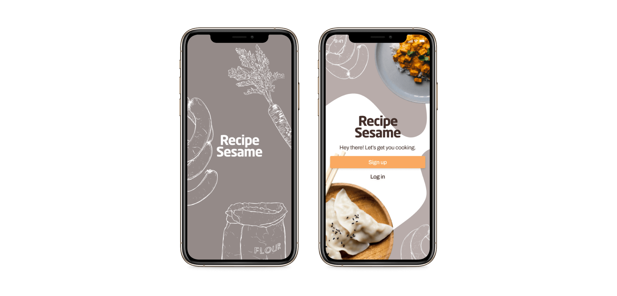
Recipe Sesame's mission is to make cooking accessible and enjoyable for everyone. As a smart cooking assistant, recipes are recommended based on personalization to account for all of your dietary needs.
The COVID-19 pandemic has forced us to reevaluate our relationship with the kitchen. According to studies, folks continue to cook frequently at home as a result of quarantining during the last two years. As the hybrid workstyle pulls more people back into the office, home cooks once again find themselves scrambling to juggle the tasks of meal preparation and grocery shopping while adjusting to the return to office.
Recipe Sesame was created to assist users in quickly discovering new recipes and identifying the necessary ingredients. Tailored meal recommendations and integrated grocery list make the planning process easier than ever. As a mobile app, Recipe Sesame enables busy working professionals to plan meals ahead of time at the ease of their fingertip.
UX research, UI design, brand identity

The initial research aimed to gain a better understanding of the user's objectives when finding and organizing recipes.
What are the existing products for finding recipes?
How do users interact with existing products?
What are current pain points with existing products?
What features of existing products do users utilize the most? Or wish they have?
An exploratory survey was sent out to gather community feedback on how people discover recipes. 36 responses were collected from several cooking-related Reddit and Facebook communities. Participants varied from age 18 to 55, with varying levels of expertise in cooking.
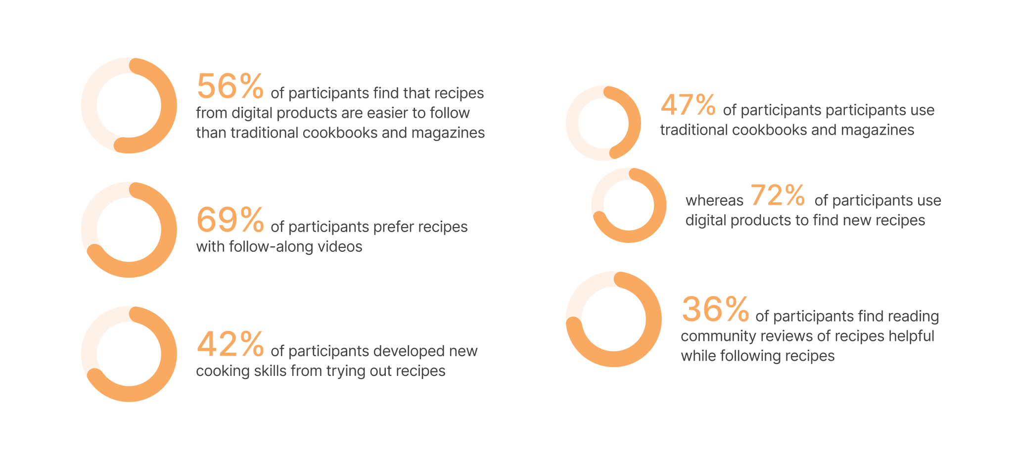
While conventional cookbooks and magazines remain popular, users still prefer digital products when seeking recipes.
A large majority of users rely on cooking videos when following recipes.
Community reviews offer additional guidance for amateur home cooks.
Three existing recipe apps were considered for a competitive analysis to determine their relative capabilities and weaknesses.
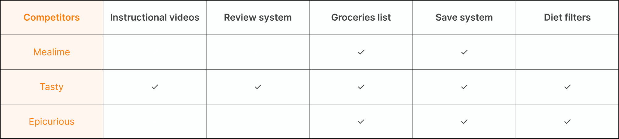
There is inconsistency present among the types of dietary restriction filters of competing recipe apps.
Instructional recipe videos are often unavailable from current competitors, despite being an essential feature users typically seek for.
The integrated grocery list and save features are prevalent among existing products and should be provided by Recipe Sesame as well.
Five participants were chosen for a series of in-depth interviews to assess their opinions on recipe-related products. Participants include working professionals in their twenties and thirties who cook for themselves and/or their loved ones on a regular basis.
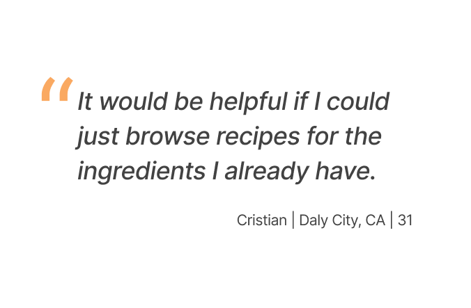
Recipes should be identified by their ingredients to make them stand out in search results.
Video instructions are proven to be a vital feature for digital recipes for its ability to provide visual affirmations.
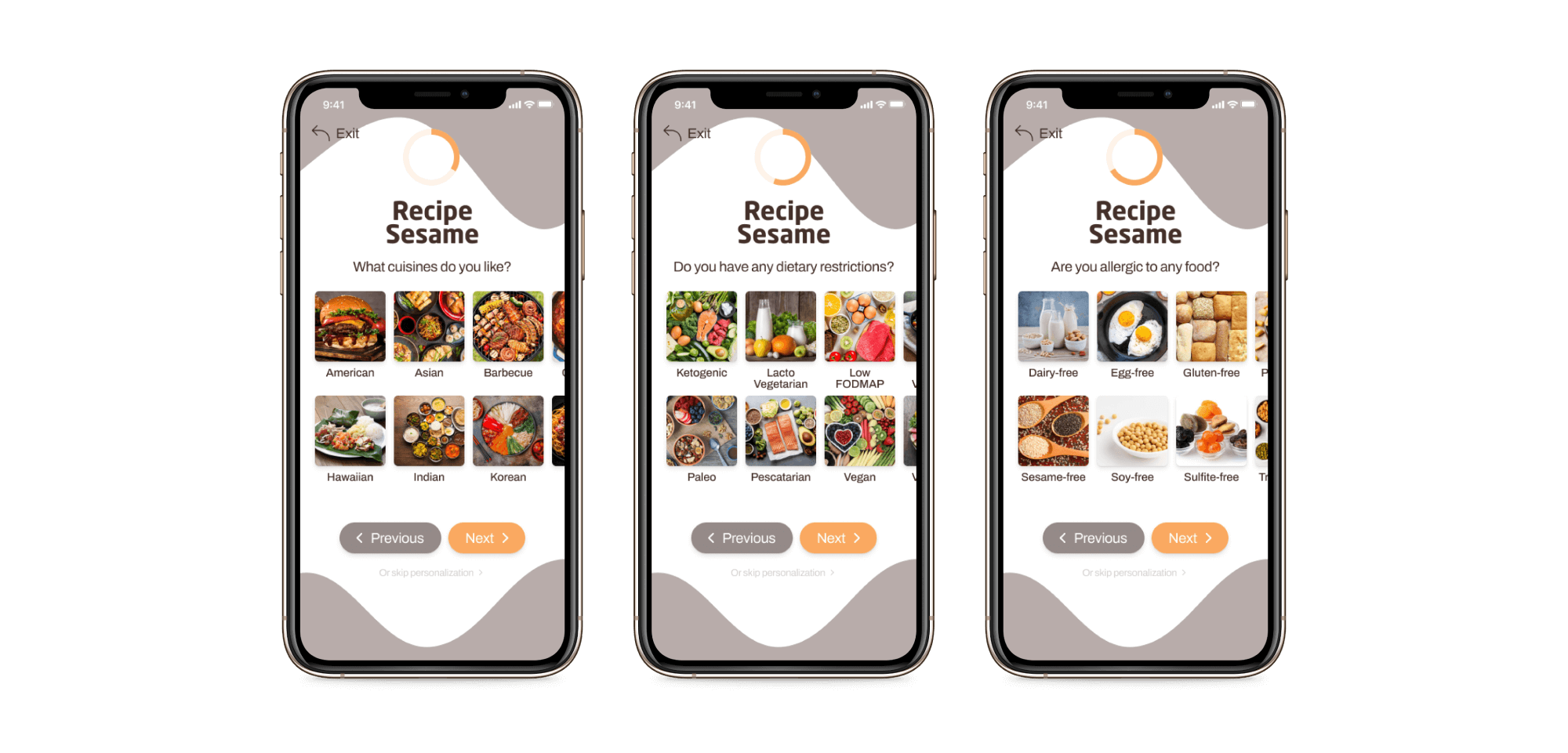
To make the personalization process easier, users should be prompted to input their diet preferences and restrictions during onboarding so that content may be appropriately personalized.
Insights gained during the Discover phase are expanded upon to uncover themes and opportunities, establishing the groundwork for the app's core structure.
An affinity map was constructed to organize high-level themes and relevant insights acquired from the surveys and interviews.
Charlotte, the user persona, was created to bring the findings of the affinity map to life. Charlotte's needs and frustrations are articulated in order to clearly identify the objectives that Recipe Sesame must fulfill.
A user flow diagram was created to explore the different ways Charlotte may navigate Recipe Sesame in.
A sitemap was designed to thoroughly identify the structure within Recipe Sesame and the screens that populate the app.

The ideation phase follows with the app structure taking shape through the process of wireframing. Wireframes were then used to construct the first low-fidelity prototype.
I started sketching to get my early thoughts down and generate rough ideas for the interface and its layout.
I developed the wireframes further on Figma by adding more details to individual elements, eventually connecting them to create the first prototype.

Going into the last phase of design, the low-fi prototypes underwent a series of usability testing before they were polished into higher fidelities. Feedback received during testing was then adapted into the final design to ensure Recipe Sesame is simple and intuitive to use.
A usability study was conducted with three participants to determine where adjustments could be made to better meet user expectations.

Participants expressed a desire for a broader variety of information structures at the Home feed, such as trending recipes and previously viewed recipes.
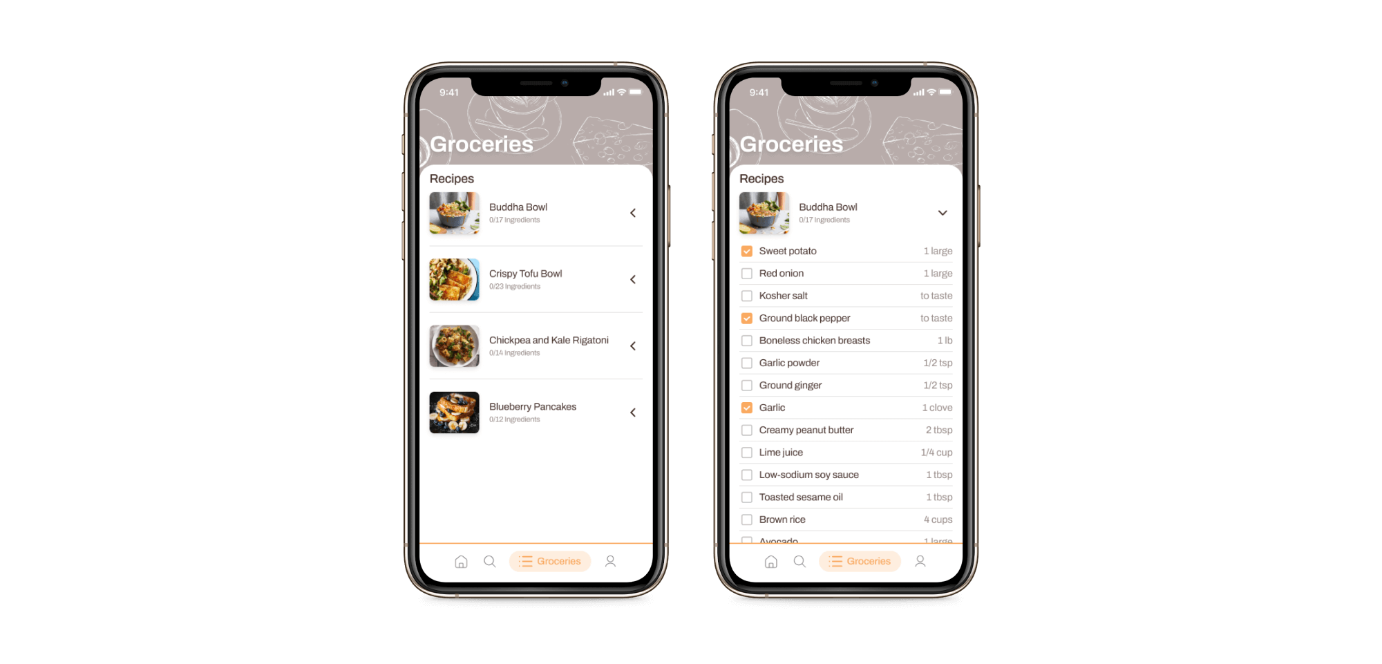
Groceries list interface should simplify to only one type of organization structure.
An expansion on the Reviews section is needed to help users navigate it more easily.
As a smart cooking assistant, Recipe Sesame makes recipe discovery and meal planning simple and enjoyable. Content is tailored to the user’s preferences and taste, ensuring a curated experience for all types of diets.
Splash screen and sign in
Recipe Sesame asks for user diet practices and curates content accordingly.
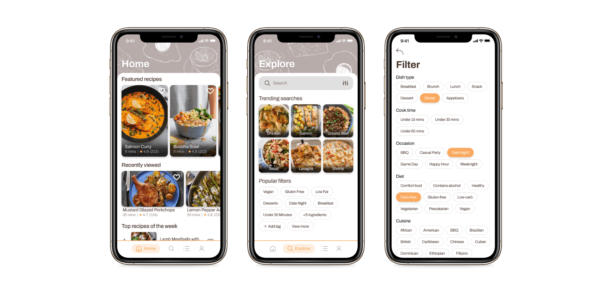
Easy recipe discovery through the Home feed and filtered searches at the Explore screen.
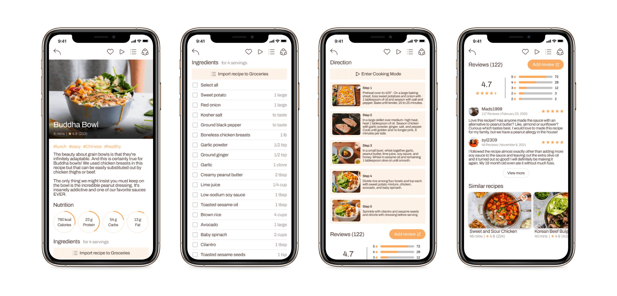
Everything you need to cook your next dish; Nutritional values, ingredients list, step-by-step cooking videos, reviews and similar recipes.
Organize your groceries list and plan your meals ahead of time.
A second round of usability testing was conducted on the final prototype to reflect on changes made on the first round. Users participated in the core user flow of completing a sample recipe.
I investigated the user interactions and discussed in 1-on-1 interviews with the participants after their testing sessions. Findings are synthesized below.
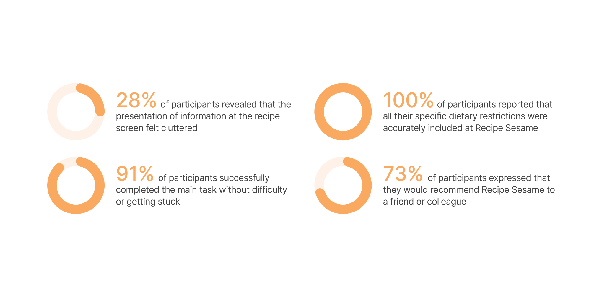
The main user flow was mostly successful at aiding users completing a recipe, with some room for improvement at certain hesitation hotspots.
The recipe screen's content layout should be adjusted to allow for more breathing room.
Users were particularly happy about their dietary restrictions appropriately included in the onboarding sequence and at the Search screen’s filters.
© 2021