UX, UI, Web Design, Identity, Conceptual
2022
8 weeks
UX/UI Designer

AQUA: The Redesign is a makeover of an outdated marketing website that struggles to meet modern user experience criteria. The redesign optimizes the existing information architecture and marketing approach, with the ultimate goal of increasing user engagement and conversion.
Improve user conversion by modernizing the user experience and usability of AQUA's marketing website.
Art Direction
Identity
Information Architecture
Responsive Design
Webflow Development
Initial research is aimed at determining how to better assist AQUA’s customers in finding what they need on the website. Eight previous and current clients were selected for in-depth interviews on their motivations and frustrations in relation to AQUA’s services and website. An usability audit was then conducted on the existing website to validate issues raised during the interviews.
During the investigation into the clients’ experience with AQUA, valuable insights on the website's usability and access to information emerged.

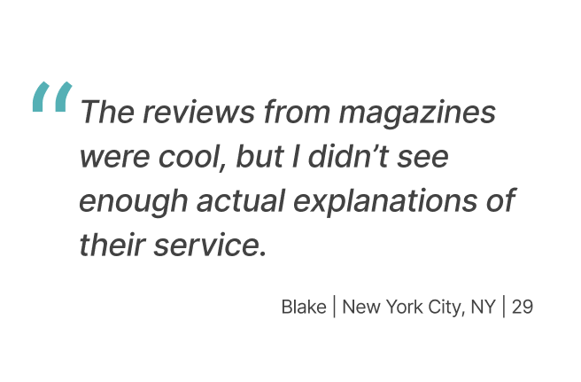
Prospective clients expect to see previous customer testimonials to adequately evaluate the service available.
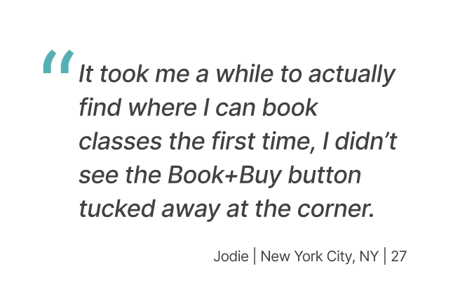
The current system of CTAs is not reaching users effectively, with more than a quarter of the interviewees experiencing difficulty in booking a class.
Clients seek more informative explanations of the service itself, not just article quotes from the press.
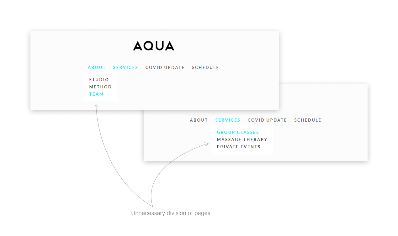
Nested subsections within the main navigation require additional clicks that users may miss easily or don't have time for.
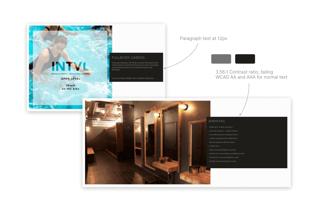
Readability is jeopardized as important text regarding the product is often presented in sizes as small as 12px. Additionally, the text to background contrast ratios fail to comply with WCAG metrics for normal text.
With over 5 different type styles found throughout the site, the design becomes distracting and incohesive.
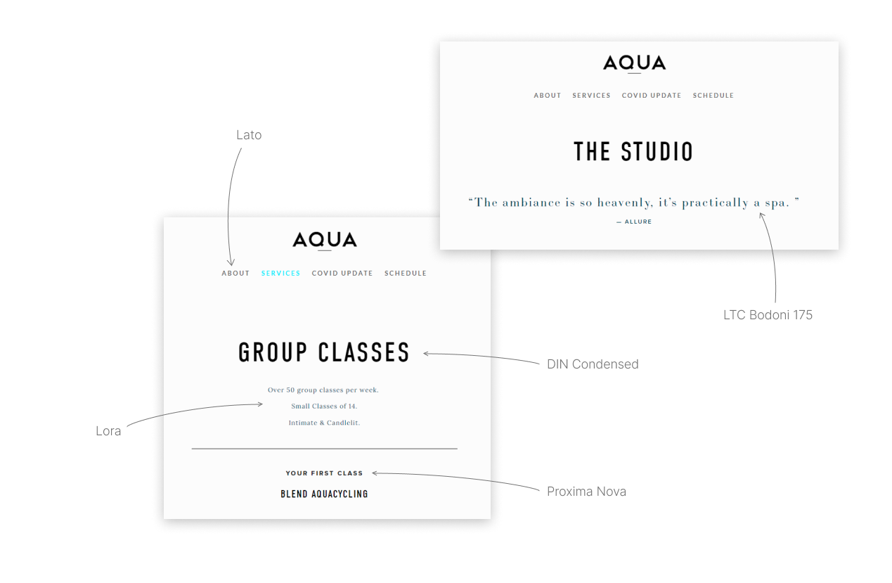
There is no obvious distinction between headers, subtitles, and CTAs, making it difficult to efficiently direct users to the product.
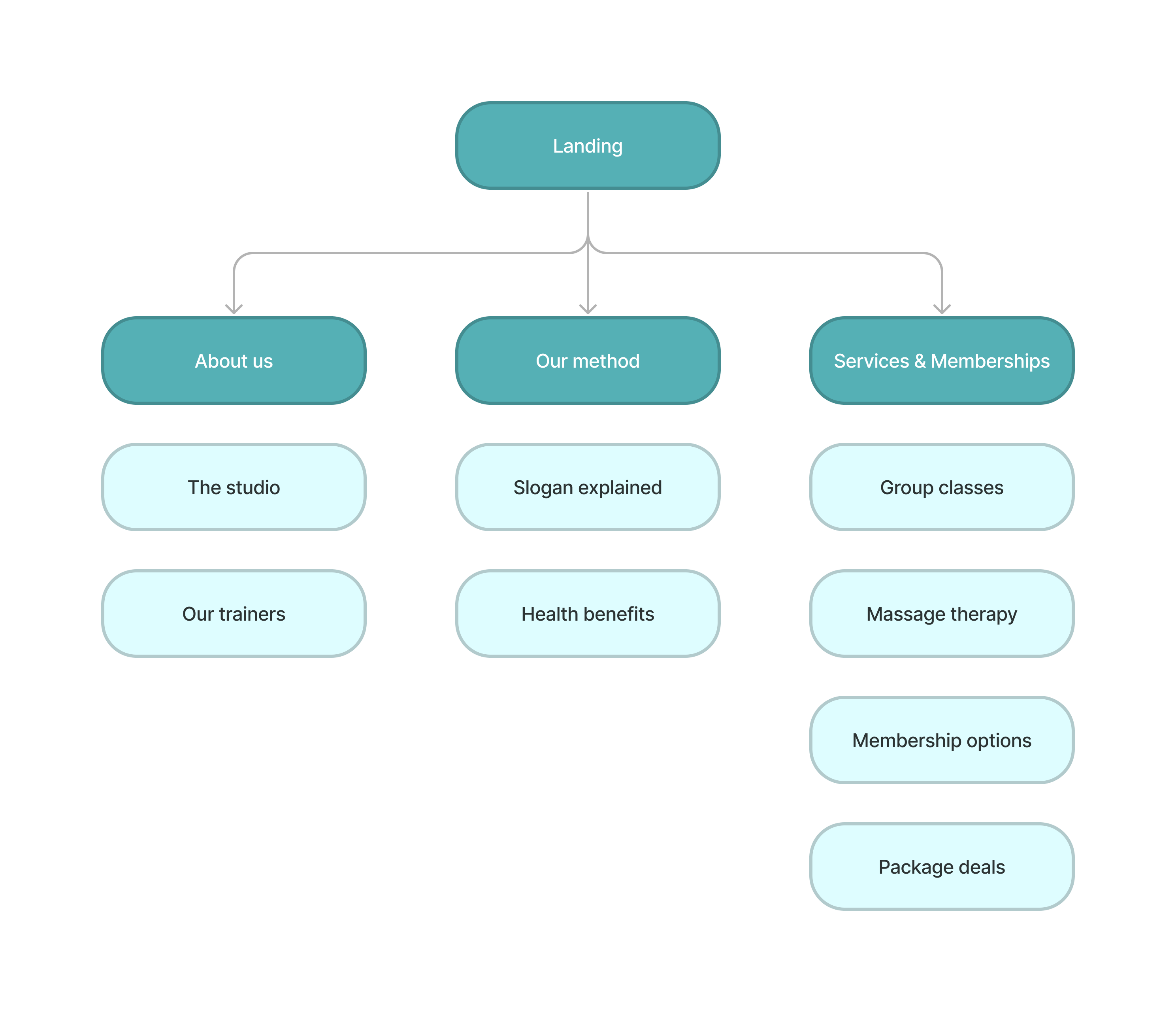
After identifying the areas for improvement, I began conceptualizing the new layout using a sitemap and wireframes. The key objective was to provide a clear path from the landing page to services available.
To make the original layout more intuitive, I consolidated relevant material onto single pages and renamed the main navigation menu items.
The wireframing process was driven by the need to create effective CTA design and cohesive branding identity, as suggested by insights from the research phase.

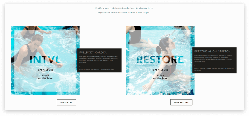
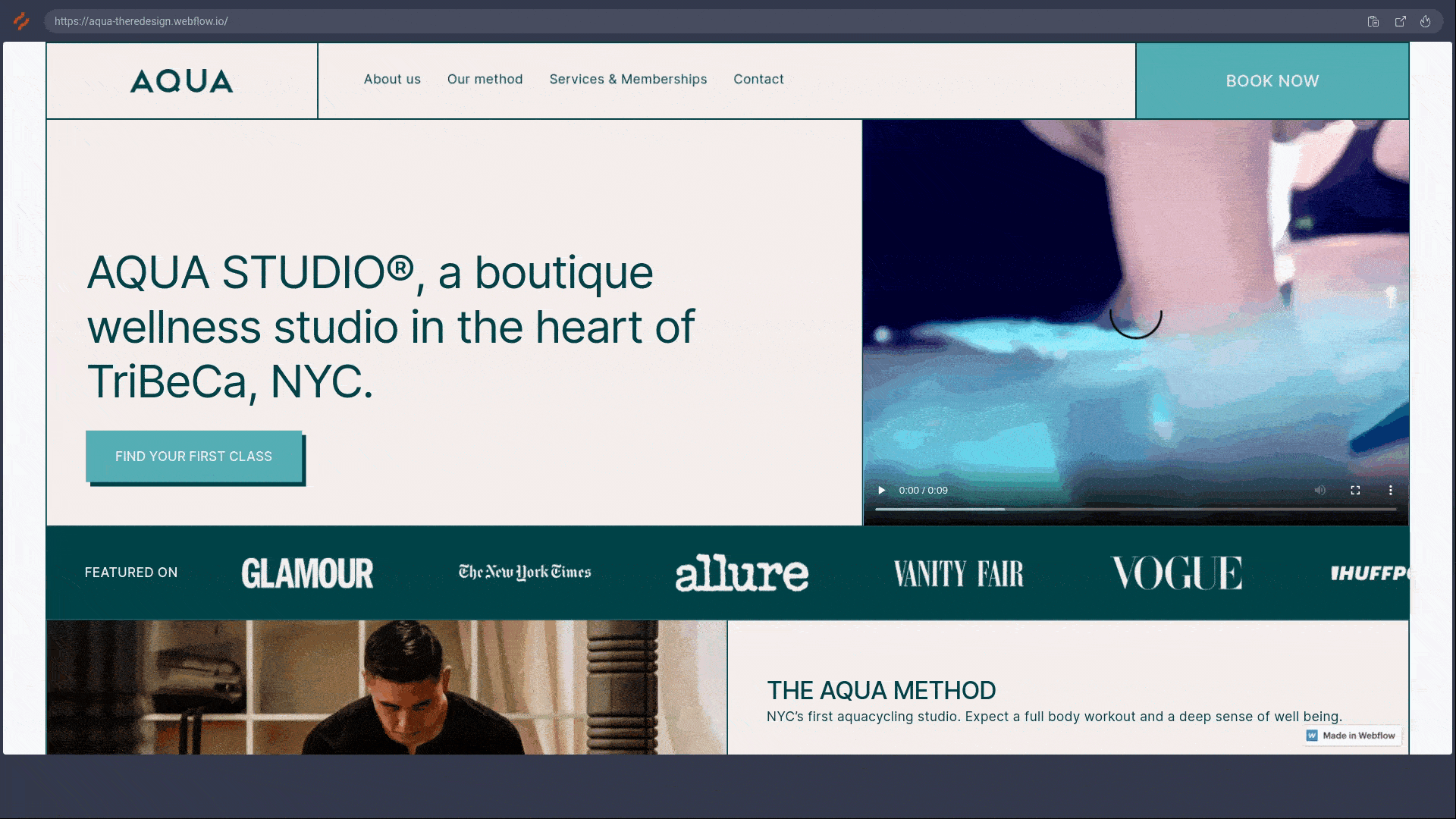
AQUA’s new look was inspired by editorial magazines, enabling the user to browse comfortably while still learning about the services offered.

In addition to the desktop design, all pages within the redesigned site have responsive breakpoints at tablet and mobile screen sizes.
To better assess the impact of the redesign, a second round of usability testing was carried out on both the original and new sites using Hotjar's screen tracking analytics tool. The study aimed to track conversion improvements through examining shifts in user behavior and interactions as recorded by Hotjar.

Interactions were investigated and discussed in 1-on-1 interviews with the participants after the testing sessions. Findings are synthesized below.
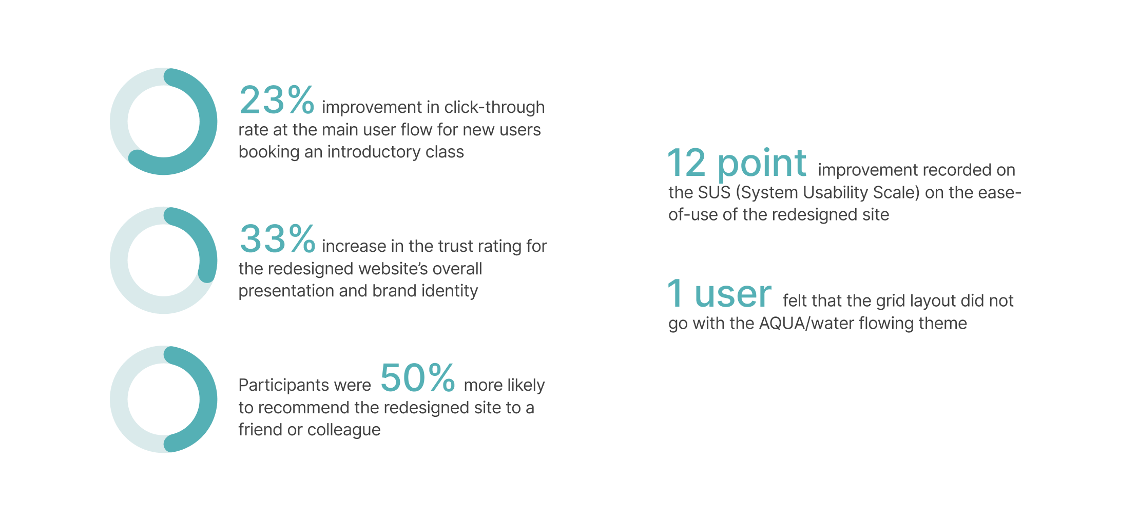
The new system of CTA placement is adequately directing users to the services available.
Users were more confident in the overall appearance and brand identity of the redesigned site.
Issues like the layout disagreeing with the product’s theme should be considered and accounted for earlier in the Define and Design phases.
© 2021